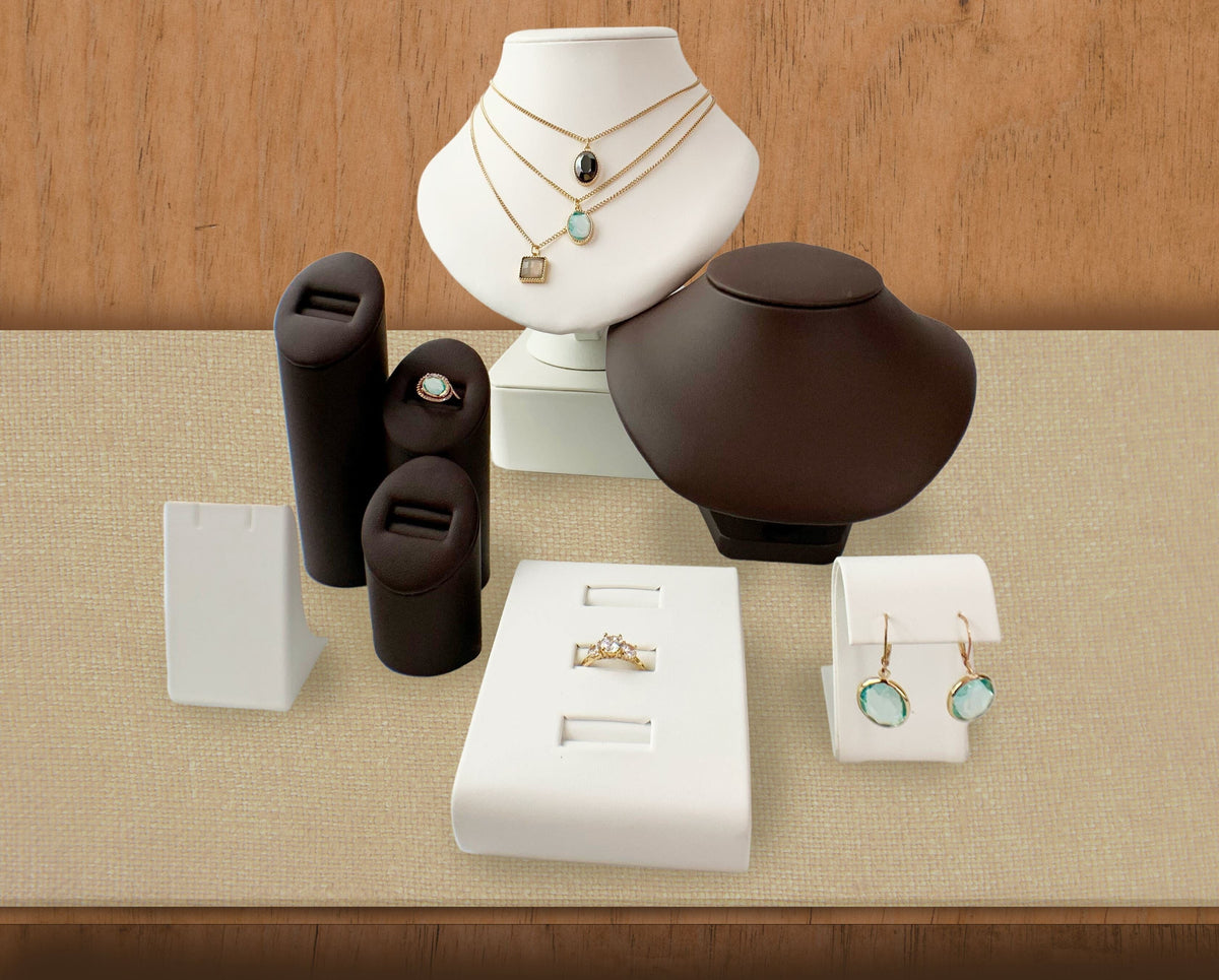
Jewelry Display Ideas for Retail
In-store retail jewelry displays are directly linked to sales. When researched by the NPD Group, window displays were found to influence 24% of purchases. Once customers actually visit your store, displays play a much larger role in affecting their decisions.
Think of it this way: 7 out of 10 customers visiting a store come with the intent to buy. This gives your jewelry displays a lot of power that can be harnessed to engage those customers and drive more sales.
What’s included in this post?
- Jewelry display ideas for boutiques and retailers
- How to display jewelry: Practical tips for setting up your jewelry display case
- Map your showcase
- Include white space
- Use vertical display space
- Place lots of mirrors
- Factor in portability
- 6 jewelry displays every jewelry retailer or boutique should have
- Jewelry display hacks you’ll want to implement today
Jewelry Display Ideas for Boutiques & Retailers
Before we begin, it’s important to keep in mind the power of jewelry visual merchandising.
Visual merchandising is the practice of displaying products with the goal to attract consumers and encourage them to buy. Visual merchandising, especially jewelry visual merchandising, can be very effective in influencing impulse purchases.
Even carefully planned purchases – where customers have an actual idea of what they intend to buy – can also be attributed to your display setup.
After all, if they don’t see the item they are actively thinking of buying, or something of its kind, then they will leave your store. It’s that simple!
The jewelry display ideas listed below can all be used together. Or, you can filter out one jewelry display idea to give your store a unique touch. (If you're looking for tips on how to display your personal jewelry collection, check this article where we were featured: Jewelry Organization Ideas: 12 Tips for a Tangle-Free Setup.)
Now, onto the jewelry visual merchandising ideas!
1. Sort and display your jewelry by its price point
Most jewelry boutiques don’t limit their stock to one type of jewelry.
In Tiffany & Co, buyers can walk in and shop sterling silver jewelry under $500 or diamond jewelry over $10,000.
Even when the jewelry selection is not so varied, there are usually different price points within one store.
2. Display your jewelry by collection
This is a popular jewelry display idea that is seen in high-end stores worldwide. The basis for this idea, as opposed to displaying jewelry by type (rings in one area, necklaces in another, etc.), is to wow the consumer with the complete set.
For this jewelry display idea, jewelry pieces don’t have to be part of an actual collection. You be the judge!
As long as the jewelry is fashioned in similar style and they complement each other, they can be presented in one showcase set. Think: a minimalist style bangle next to minimalist style pair of earrings, etc.
3. Use an accent color to add a pop to your display area
This is different from the typical two-tone jewelry display idea. With an accent color, you can simply switch up some risers and bases to different colors, change the color of a display piece here and there, and voila! You’ve just given your showcase the oomph it needed!

Pro tip: The jewelry placed on the display with the accent color should be worth accentuating, as this will get the eye drawn to it first.
4. Create zones with different color jewelry displays
With this jewelry display idea, you can turn your showcase into a tantalizing viewing experience.
This jewelry display idea works well with displaying jewelry by collection. When consumers see clearly defined areas designated by color, it invites them to come check it out!

Using a color-sectioned jewelry display idea also lessens the senses-overload that customers sometimes experience when faced with too much dazzling in their face. With clearly defined areas, they can appreciate each collection for its unique design.
For more on how to avoid choice overload, read our post on jewelry inventory management.
How to Display Jewelry: Practical tips to set up a display case
1. Map your showcase before so you know what to order
It’s always best to start with a sketchy plan of what you want your showcase to look like. This way, you can order the jewelry display pieces accordingly.
Don’t limit yourself, though! You want an evolving showcase with the freedom to freshen it up as you please. Buy with purpose, but not in exact quantities.
Want your showcase to be designed by a professional? See Allure’s complete showcase sets that can be further customized for your store.
2. Include white space
Also known as negative space, in visual merchandising white space refers to the empty space between products. This gives the eye “a break” so that it can process each item without being overwhelmed by the entire display.
As with everything in design, white space is a balance! Too much and your display case looks empty, too little and it looks overcrowded.
Experiment by removing and adding display pieces. Even better, get yourself a second opinion to help get it right.
3. Make use of vertical display space, not only horizontal
What do cities do when their streets reach their dwelling capacity? They move up!
Maximize your showcase space without overcrowding by mixing taller and shorter elements. You’ll get additional points for design, plus it’s easier on the eye, leaving more of the “white space” between jewelry.
4. Place lots of mirrors
Nobody wants to wait their turn at the mirror. The best way to encourage customers to try on jewelry is by providing plenty of mirrors.
You can even have foldable mirrors if you choose, such as Allure’s leather folding mirror below, especially if you are displaying your jewelry at a show.
See more jewelry retail mirrors here.
5. Think how portable you want displays to be
If you plan to remove them from the showcase every night, or are setting up for a show, consider displays that are easy to move around.
Some options include lightweight trays, fold-over necklace stands, chain boards with easels, and more.
6 Jewelry Displays Every Jewelry Retailer or Boutique Should Have
Below, you’ll find ideas for jewelry displays that can add diversity to an otherwise blah showcase.
Use these jewelry displays in moderation for your statement pieces, or get creative by placing more of them to tie your showcase together in a streamlined way. (Example: align them in a row in the front or back of a setup.)
1. Watch or Bangle Pillow
A watch or bangle pillow adds variation and a touch of softness to your overall setup. This watch pillow displayed here can also stand upright for a more dramatic presentation.
2. Single Ring Stand for Statement Ring
Part of the goals for visual merchandising is, of course, to highlight a product’s inherent beauty. A single ring stand achieves this goal perfectly.
This retail jewelry display idea does not have to be a classic ring finger! There are other great single ring displays that will add a wow factor to your showcase.
Consider these:
3. Earring Tree
An earring tree shows those dangling beauties like no other earring display can. Like the name implies, earring trees allow you to “hang” earrings off its branches.
Include one or more in your set. Earring trees are also great for varying heights!
4. Bases and Risers
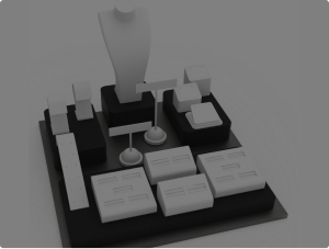
Jewelry display bases and risers provide more vertical space and also add interest to your showcase. They are a must-have if you are aiming for a bona fide professional look.
Even when looking at an image exclusively showing bases and risers, it’s easy to see why they would give a professional touch. Just look at that modern modular effect!

5. Tall Neck
Tall neck jewelry displays are more versatile than you might think. In addition to that gorgeous necklace you want to display, tall neck busts are great for layering several thinner pieces at once.
The tall neck featured here is a window staple! Use two tall necks in a face-off position for a dominating window display.

6. Bracelet Ramp or Bracelet Dome
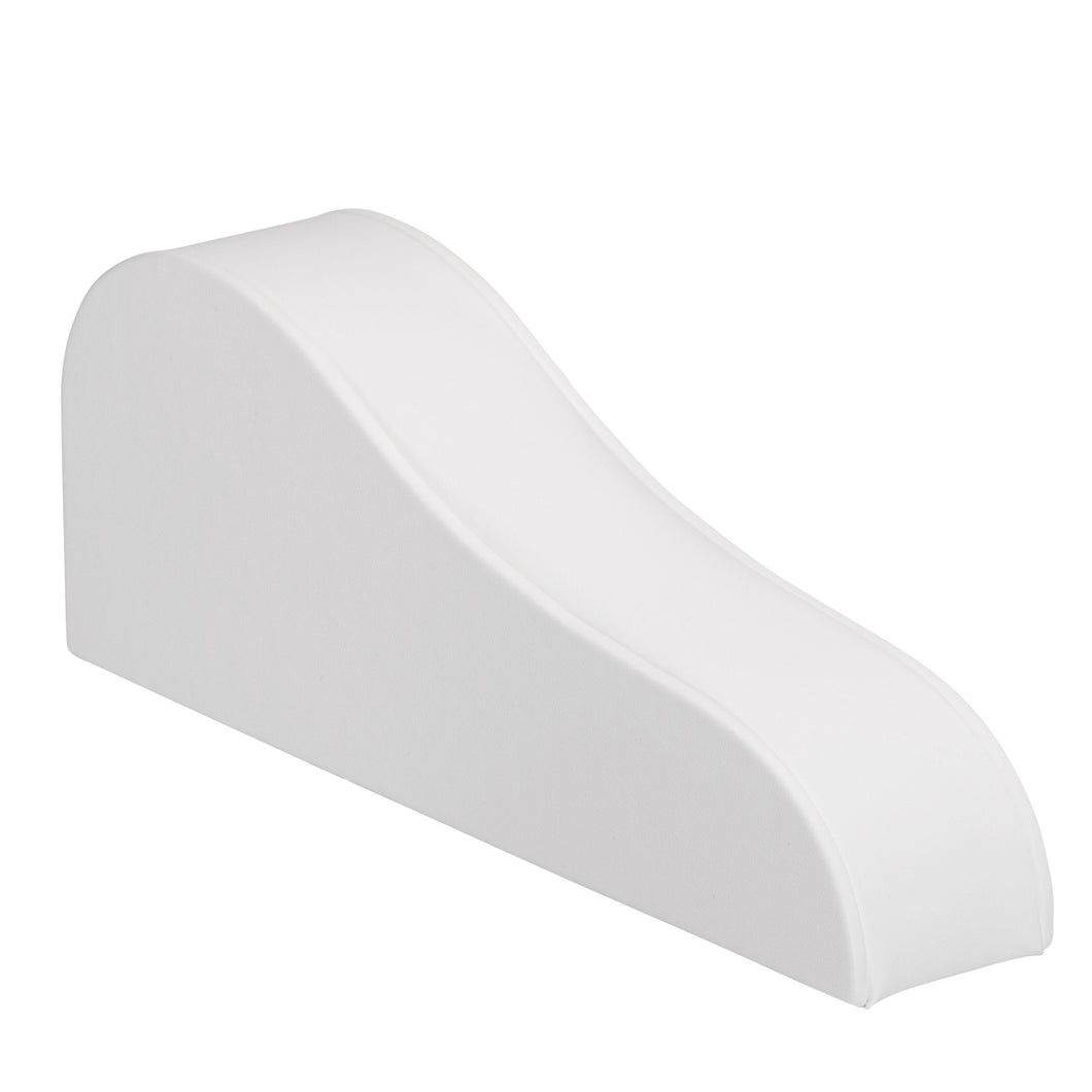
Whether you prefer them gently sloped or with a straight incline, bracelet ramps give your display a neat flow.
If your showcase was missing the element to tie it all together, this may just be it!
Place the taller end of a bracelet ramp next to a display piece of medium height to gently guide the eye down. These are typically placed toward the front of a display setup.

No need to worry about the bracelet slipping off! This bracelet ramp has an elastic to keep the bracelet in place.
Jewelry Display Hacks You'll Want to Implement Today
Instantly level up your standard showcase with jewelry display tips that make all the difference, taking only seconds to achieve.
It’s that instant face-lift your showcase needed to attract more sales!
1. Remove anything placed in the first three inches of the display case.
The eye may miss those pieces, and it only serves to detract and add clutter to your overall look.
2. Search for display pieces that can be grouped together.
It’s best if you find the same display pieces in varying heights. By placing them adjacent to each other, you’ll be able to add more “white” space to your showcase setup.
Be mindful that, like taller displays, grouped displays of different heights generally belong in the back, so set them up there.
3. Pluck your displays with curves from the middle of a showcase set, and place them at the edge of the collection.
This may sound insignificant, but curved elements really work to draw the eye onto the next showcase set.
Here’s why:
When studying curved edges, researchers found them to better suit natural head and eye movement. Therefore, what better way to invite viewers to continue their eye sweep than with curvy displays?
Plus, displays with curvy designs add vibrancy to your showcase, and setting them at the edge of your showcase gives your entire showcase, well, an edge…
Examples of curvy displays that encourage the eye to continue exploring:

Pro tip: Use two of the same curvy displays on either side of a set to give your display area a symmetrical look.
4. Choose a signature piece for your focal point
The center back of your showcase is your prime spot! Designate it for a unique item, a bestseller, or change it up every day for something new.
Be sure to point it out to consumers!
Conclusion
I hope you found a new display idea here that you’ll be excited to try in your boutique!
The real key is to keep refreshing your display selection and setup often. This will drive browsing customers that are hungry for more to keep returning…
And don’t forget to give your display a final look-over from the customer’s perspective! You may have missed a large display obstructing their view.
Last pointer to remember: Nothing’s set in stone. You’re not nailing in your display pieces! Feel free to have fun with your setup!

